Case Study — 2026
Branding
MENDELL'S MAINTENANCE.
A full brand identity for a Dutchess County property maintenance company. Logo, color, type, and a phased rollout built to grow with the business.

A full brand identity for a Dutchess County property maintenance company. Logo, color, type, and a phased rollout built to grow with the business.
Mendell's Maintenance is a full-service property care company run by Josh Mendell out of Dutchess County, New York — lawn care, landscaping, handyman work, snow removal, and everything in between.
The category is full of brands that look either too corporate or too DIY. Josh needed something that felt professional enough to land commercial accounts and approachable enough to keep residential clients calling back.
We built a bold, rooted identity: a botanical M mark with leaf and branch detail, a forest green and amber palette, and a type system in slab serif and condensed sans. Phase 1 is fully deployed across brand system, business collateral, and merchandise — business cards, apparel, digital. Phases 2 and 3 are scoped and ready when the business needs them.
Josh Mendell — owner/operator. Full-service property maintenance serving Kent, Hopewell Junction, Fishkill, LaGrangeville, and surrounding Dutchess County.
A complete brand identity from scratch — something professional enough to compete, grounded enough to feel local, and built to scale across print, digital, and apparel.
Complete brand system, full lockup and shirt logo, business cards, Instagram ad, coffee mug, hoodie, and tee — all deployed in Phase 1. Phases 2 and 3 are road-mapped as the brand grows.
This was a start-from-zero engagement. No existing mark, no prior visual language — just a business, a service area, and a clear sense of what Josh wanted people to feel when they saw the name.
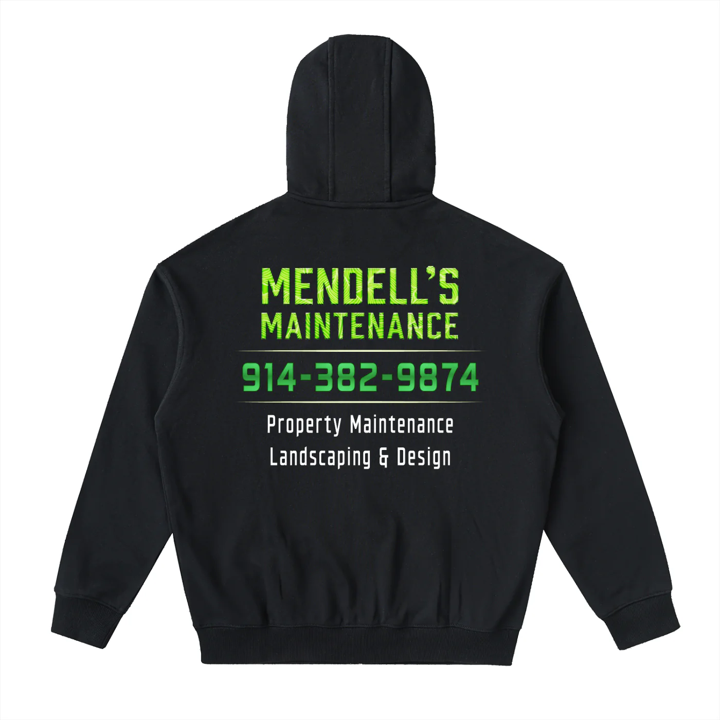
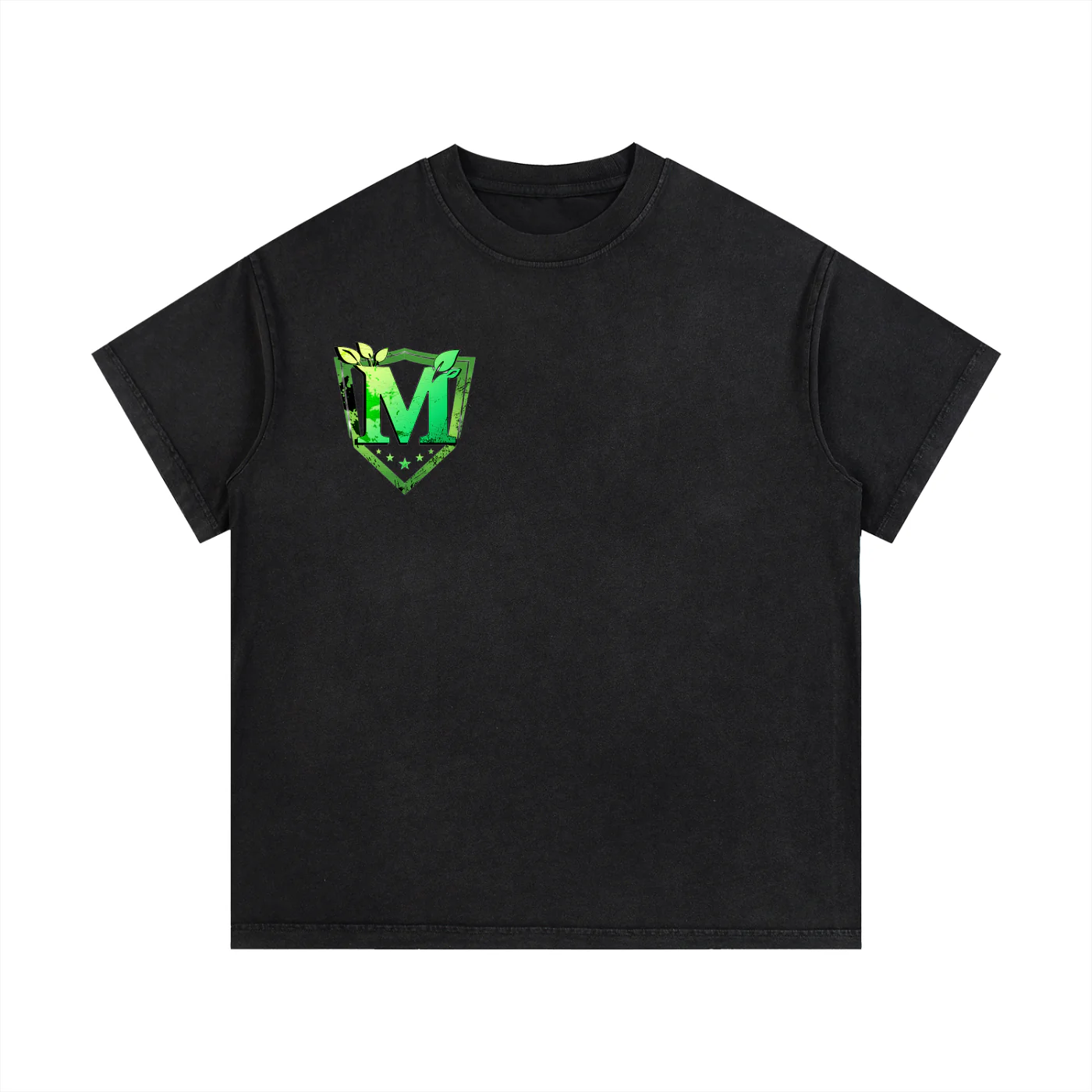
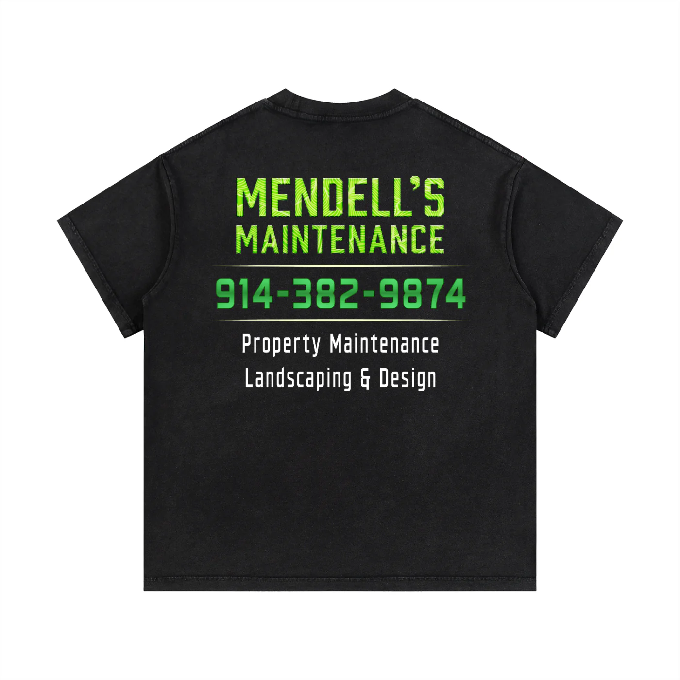
We started with the logo: a bold botanical M that leans into the craft and outdoors nature of the work without dressing it up in generic "nature brand" clichés. The forest green and amber palette reads as grounded and seasonal. The type system — Arvo slab serif and Barlow Condensed — gives everything weight and legibility across small formats like business cards, shirts, and truck doors.
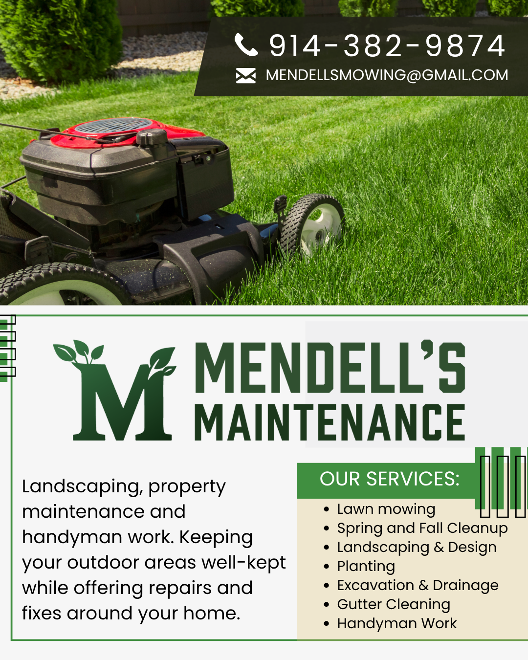
Phase 1 covered everything needed to launch: full logo system, color, type, business cards, social kit, digital flyer, T-shirt, and hoodie. Phases 2 and 3 are road-mapped — vehicle wraps and trade show materials are next, followed by seasonal campaign work as the business grows.
Botanical M mark, wordmark, full lockup. Forest green + amber palette. Arvo + Barlow Condensed type system. Brand guidelines delivered.
Business cards, social icon set, digital flyer, T-shirt, and hoodie. Everything needed to launch, look professional, and start building recognition.
Vehicle wraps (truck + trailer), trade show banners, extended merch, and seasonal campaign assets — scoped and ready when the time comes.
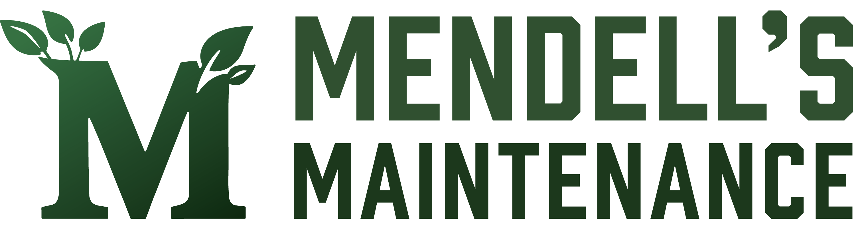 01 · Full Logo
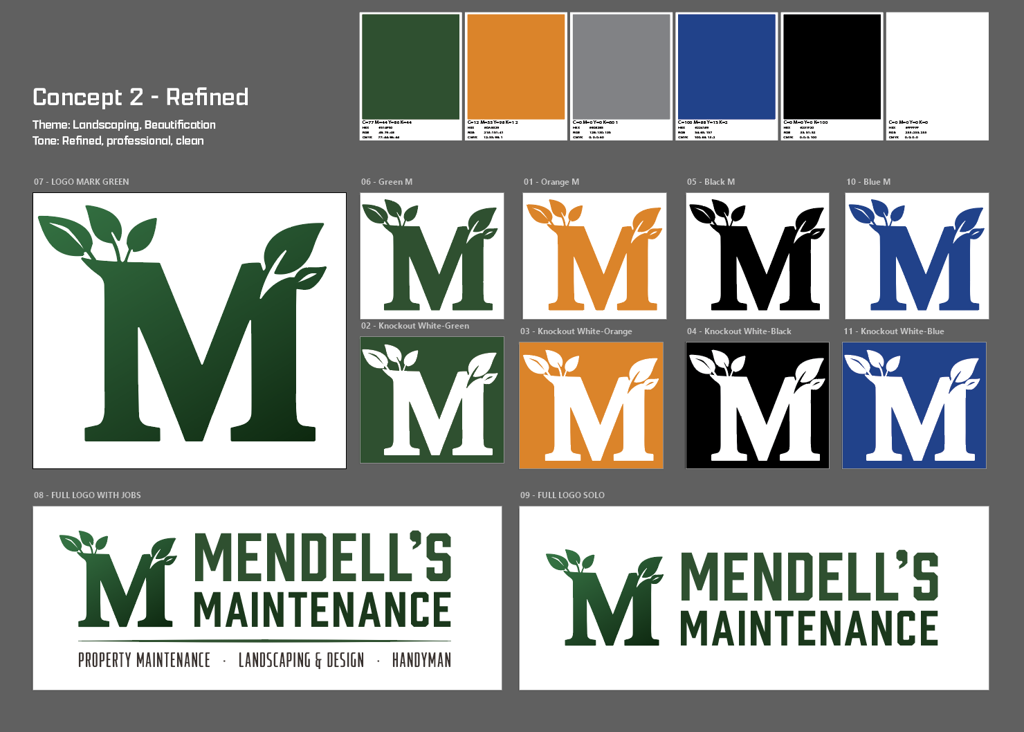 04 · Brand Overview
 05 · Shirt Logo
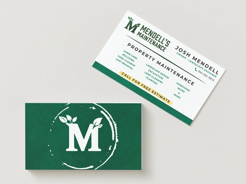 06 · Business Card
 07 · Instagram Ad
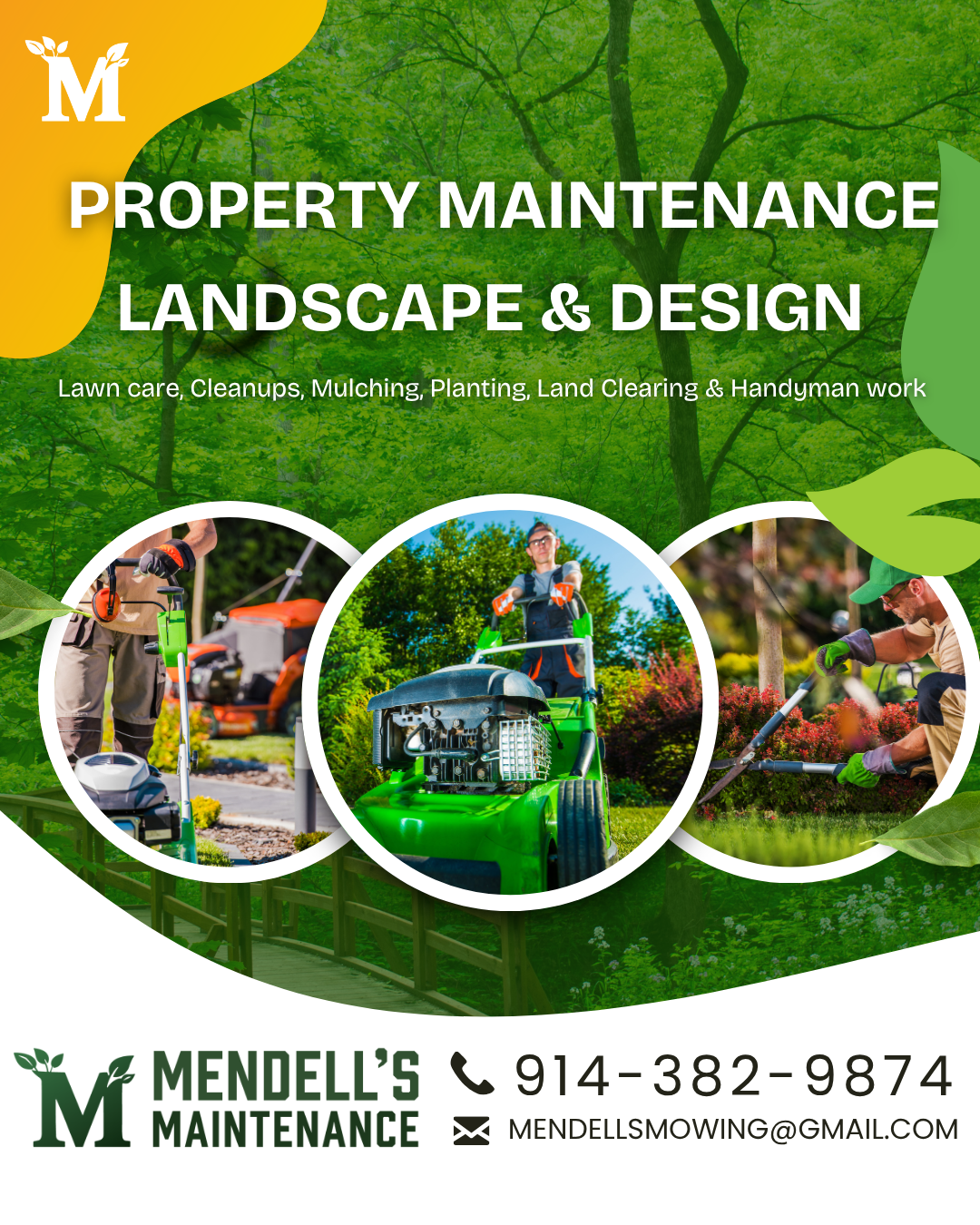 08 · Instagram Ad
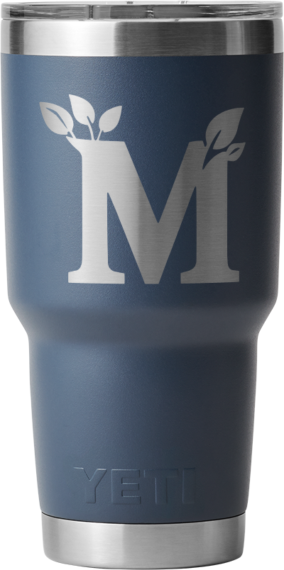 09 · Merchandise
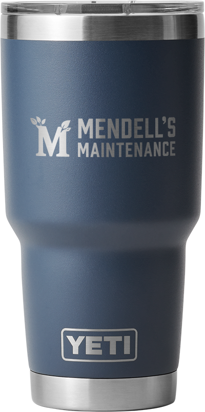 10 · Merchandise
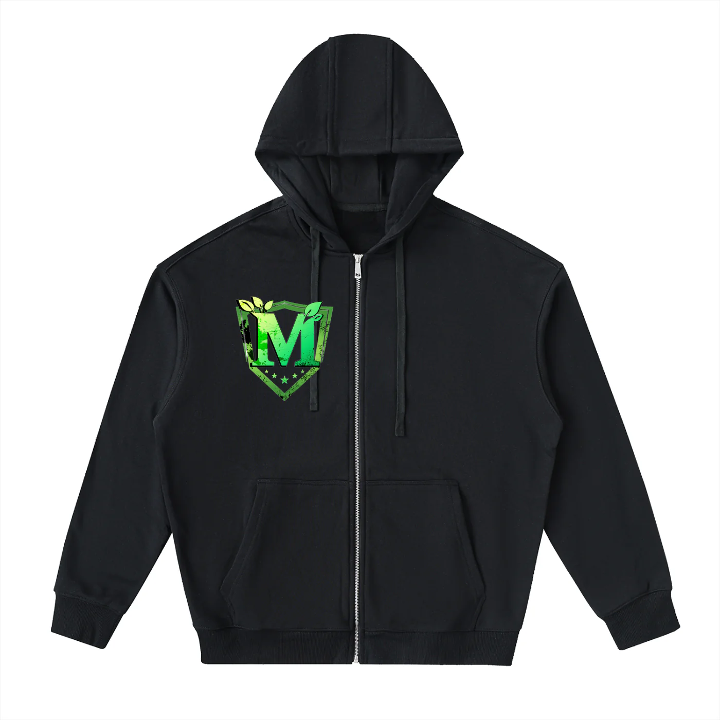 11 · Merchandise
 12 · Merchandise
 13 · Merchandise
 14 · Merchandise